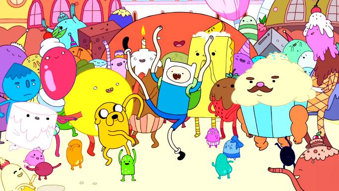
I'm a huge fan of Cartoon Network's Adventure Time, a show I've been watching for nearly its entire run. Adventure Time generally has a very bright and saturated color palette:
Given the show's unique palette and art style, I wanted to do a color analysis of the show. I'm curious which colors are used most frequently, and how they may change over the course of the show. But before I do that, I'd like to look at title cards.
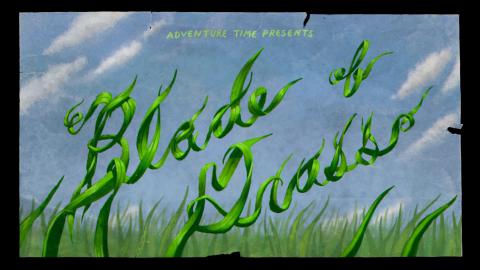
Each episode features a pulpy, grainy title card. This gives the viewer some expectation of what the episode will be about, while also introducing the title of the episode.
Each title card has a clearly defined color scheme, but it's difficult to say whether there is much of a shared color scheme across title cards. So I did a digital color analysis to find out.
Technique
Update: You can find my scripts for this analysis on GitLab.
Here's what I did:
- Downloaded all of the title cards in 1080p from this Imgur album (~157MB).
- Converted all images to PNG using GraphicsMagick (you can easily do all of the image manipulation with ImageMagick instead if you prefer it).
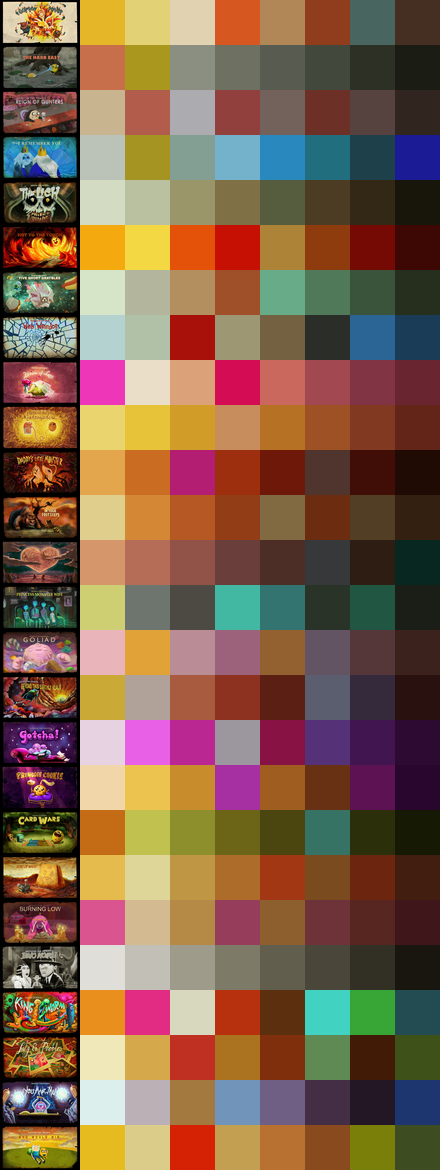
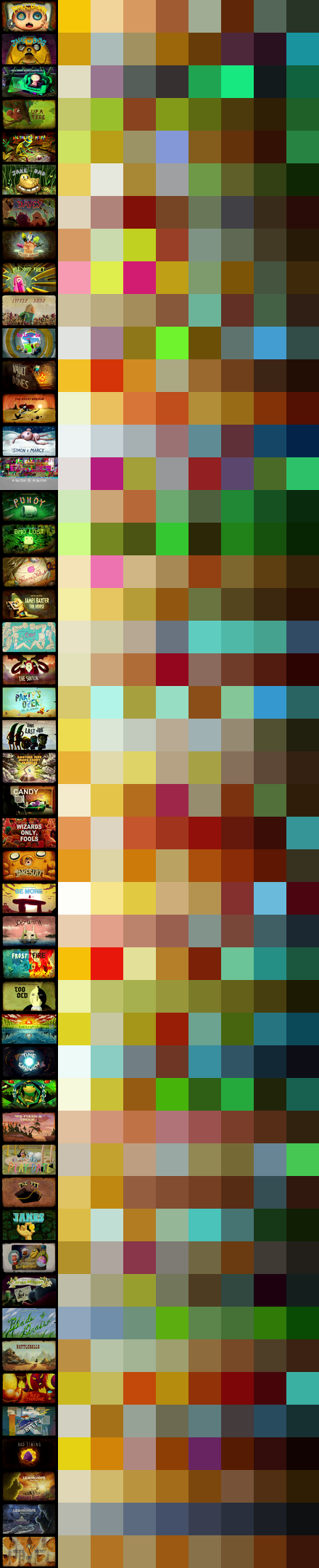
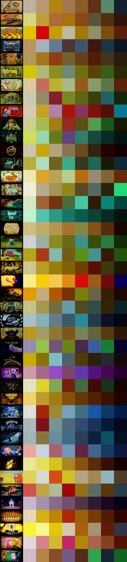
- Extracted color schemes from each individual title card using k-means clustering using 2f30's colors program.
- Sorted title cards into seasons and extracted color schemes from each season. This required patching
colorsto accept its own output as an input format.
So... what did we find?
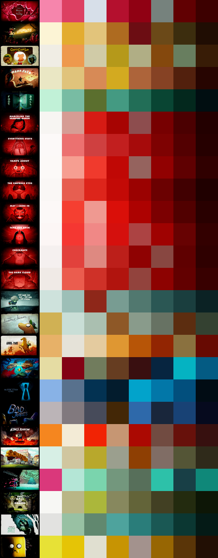
This post covers the first 7 seasons1 of the show. It does not contain explicit story spoilers, but it does include images of the show's title cards, which sometimes feature new characters or story hints.
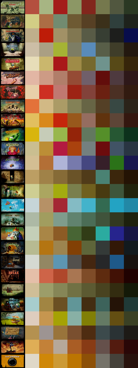
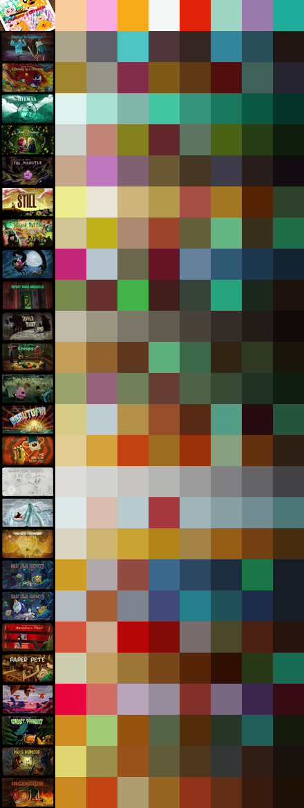
The Colors
With one exception, every title card is surrounded by a black border. I have removed black from these color schemes, since it does not add any value and takes away a precious spot from a more interesting color.


First Impressions
The most striking similarity between these color schemes is their use of muted, earth tones. Almost every season features some combination of earth tones and cool tones. Season 7 is a bit of an exception here, with its warmer color scheme - we'll explore why it's different later.
There are two likely reasons why earth tones are so prominent. First, these title cards are meant to be a homage to pulpy adventure novels, which used a lot of orange, yellow, and red on their covers. The tan colors in Adventure Time's title cards might also be a reference to the yellowed pages of these novels, but that seems like a stretch.
The second reason for the show's focus on earthy colors is that the two main characters of the show are tan and yellow:
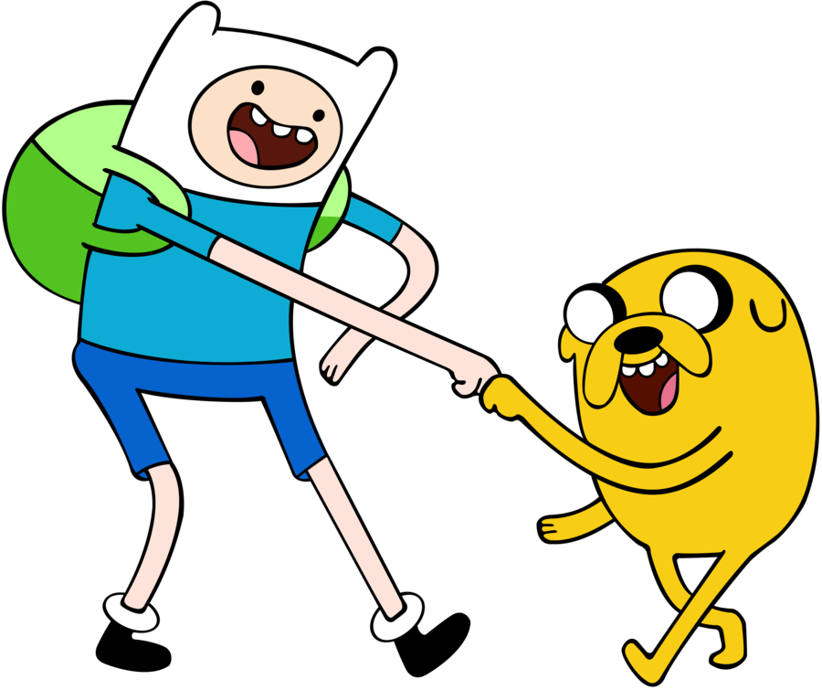
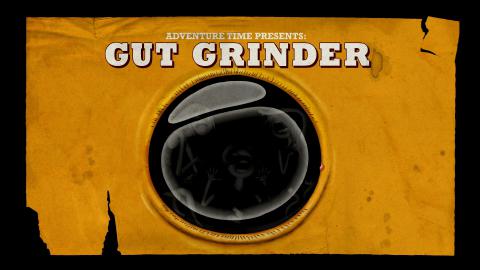
This gives title cards like The Gut Grinder a very earthy influence on its season's palette.
Other notable differences include the introduction of purple into season 2's color scheme and its re-introduction in season 4, season 2's generally brighter palette than season 1, season 6's bluer and cooler palette, and the general shift away from tan and orange over time.
Let's take a look at the title cards of each season to find out why these changes are happening.
Season 1
At first glance, it appears that Ricardio the Heart Guy and Freak City are responsible for the scarlet color in the middle of this color scheme:
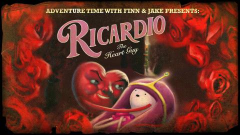
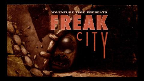
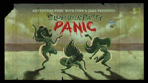
But a similar color is present in seasons 2 and 3, so these episodes can't be the only reason for its presence. Red is a common accent color in Adventure Time's title cards, such as the words in Slumber Party Panic.
It also looks like the blue color in the middle of the color scheme is primarily due to the background in What Is Life?:
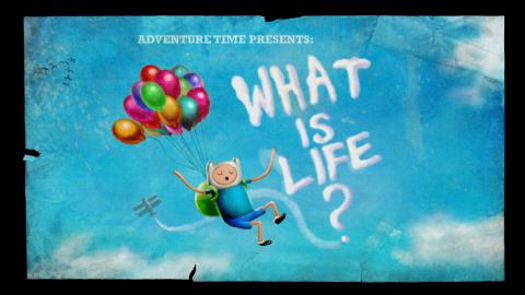
If we remove this episode from our analysis, we get this color scheme:

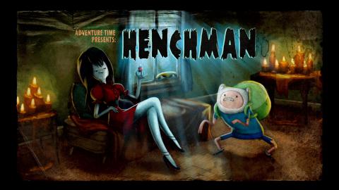
This is almost the exact same color scheme, so What Is Life? does not have as much influence as it seems. Similarly to the red color described above, there are enough blue accents in episodes like Henchman to produce this color without needing an overwhelmingly-blue title card.
Season 2
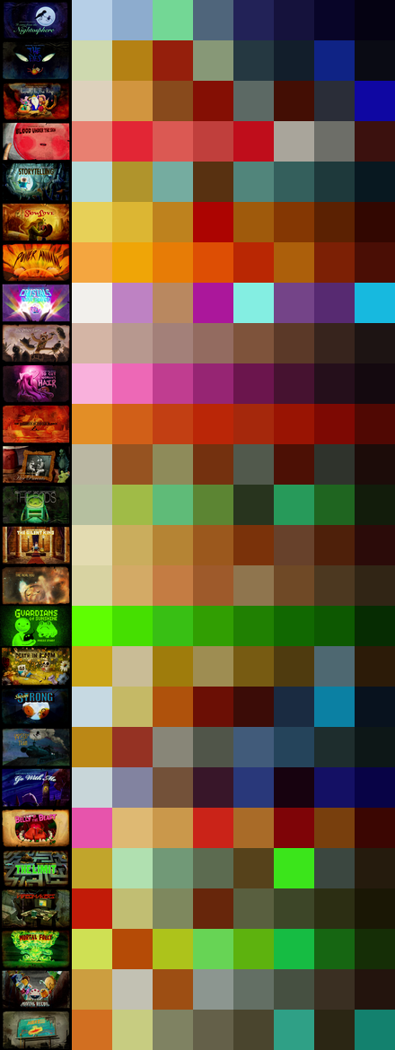
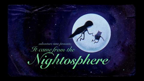
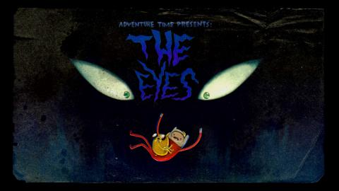
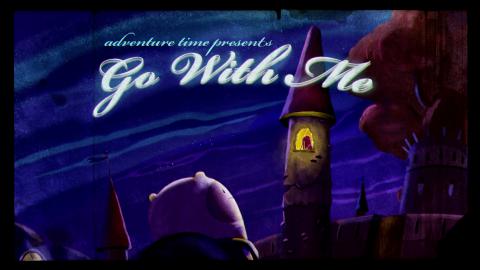
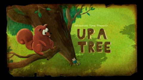
Season 2's title cards have more bright colors and are generally less muted than season 1's. We've traded in an earthy brown for a cooler blue color, thanks to title cards like Return to the Nightosphere, The Eyes and Go With Me.
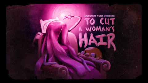
A muted purple shows up after being featured prominently in To Cut a Woman's Hair:
Excluding this episode, we get this scheme:

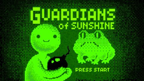
Here, we lose the purple color, and everything gets a little more muted. This looks much closer to the color scheme in season 1, except for the green color. This color is almost certainly coming from the GameBoy-inspired green Guardians of Sunshine:
By excluding that, we get this color scheme:

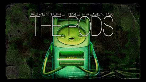
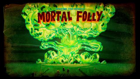
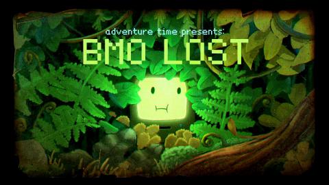
There's still some green here, but it's much more muted. This is probably a combination of The Pods and Mortal Folly.
In Adventure Time, green is often the color of evil, as well as the color of nature. (In Adventure Time, evil is a recurring force of nature; you can't stop evil, just like you can't stop plants from growing.) In this season's title cards, green is used as the color of evil.
Season 3
Season 3 uses extremely similar colors to season 1.
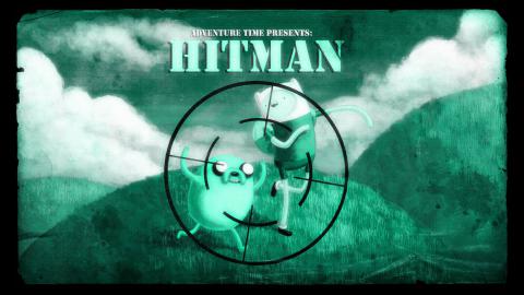
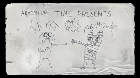
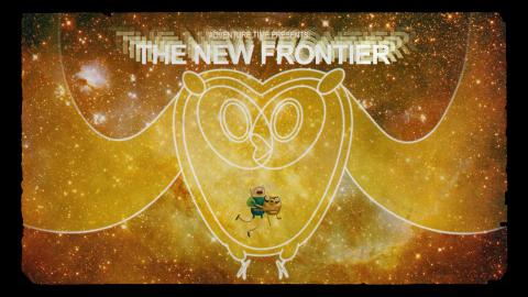
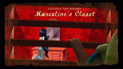
Interestingly, season 3's title cards have much more uniform and linear color ramps. For example, Hitman, Jake vs. Me-Mow, The New Frontier, and Marceline's Closet have a much clearer base color than most of season 1's title cards.
In other words, both seasons use many of the same colors. But season 1 spreads those colors across all episodes, whereas season 3 has individual episodes for each color to dominate.
Season 4
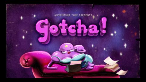
In season 4, we see purple return, largely due to Gotcha! and Burning Low.
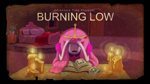
Without these cards, the color scheme looks like this:

This changes the bright purple color into a more muted scarlet color. But this is still a color that is missing from most of the other seasons. So this pinkish-purple color is fairly unique to season 4.
Season 5
For season 5, we return to the earthy-plus-blue scheme we saw in the earlier seasons.
Most notable in season 5's palette is green, which we also saw in season 2. But unlike season 2, it is not used to signify evil. Here we see it used to signify nature instead:
In season 5, green is used to show lush life, instead of the death and decay of season 2.
Season 6
Season 6's palette is a lot grayer than the previous seasons'. Episodes like Astral Plane and Chips and Ice Cream cool down the overall color scheme:
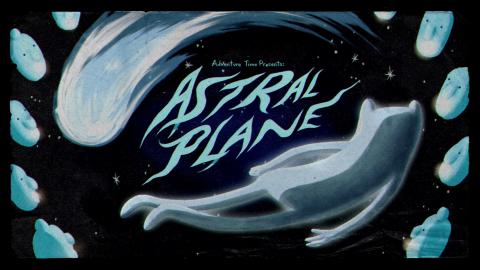
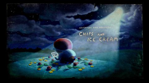
Story-wise, this makes sense. Season 6 is a season about loss and depression, so the use of blues and grays is consistent with the storyline at that point in the show.
Season 7
Season 7 is very red. Embedded in season 7 is an eight-episode miniseries about vampirism, which features blood red as a base color.
Removing these episodes creates a very short season, but it gives us this color scheme:

This is still a very different color scheme than we've seen in earlier seasons - it has stronger blues and fewer yellows.
Season 7 was already the shortest season before we removed eight episodes. Making the season even shorter by almost 1/3 gives individual episodes a lot of influence, so our color scheme could be strongly influenced by individual episodes with strong color schemes, like Bonnie and Neddie, Blank-Eyed Girl, and The Thin Yellow Line.
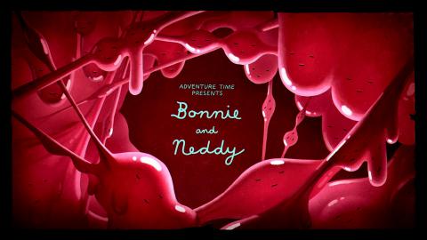
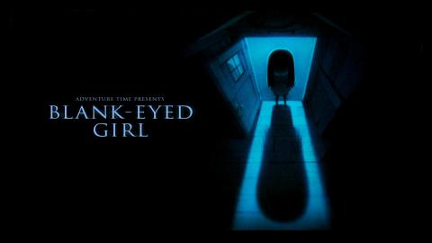
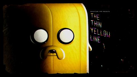
Episodes like these also contribute to the black color in this season's color scheme.
Overall Thoughts
In general, I'm surprised at the uniformity of the title cards across seasons. With a few easily explained exceptions, the seasons have extremely similar color schemes. I'm also surprised at the ability for one or two vibrant title cards to skew the color scheme.
While not surprising, it's also interesting that the title cards primarily feature muted, earthy colors in contrast to the show itself, which uses very vibrant primary colors. This makes sense, given the pulpy inspiration of the title cards, but it's still an interesting choice.
Next Week
Next week I'll go past the title cards and look at the episodes themselves! Some of the questions I'd like to investigate are:
- Is there a general Adventure Time color scheme, or does each episode use its own?
- How does color use change over time within individual episodes?
- Do different seasons have their own colors?
- Which episode has a color scheme most similar to its title card?
See you next week for more Adventure Time analysis!